Project Description
Branding.
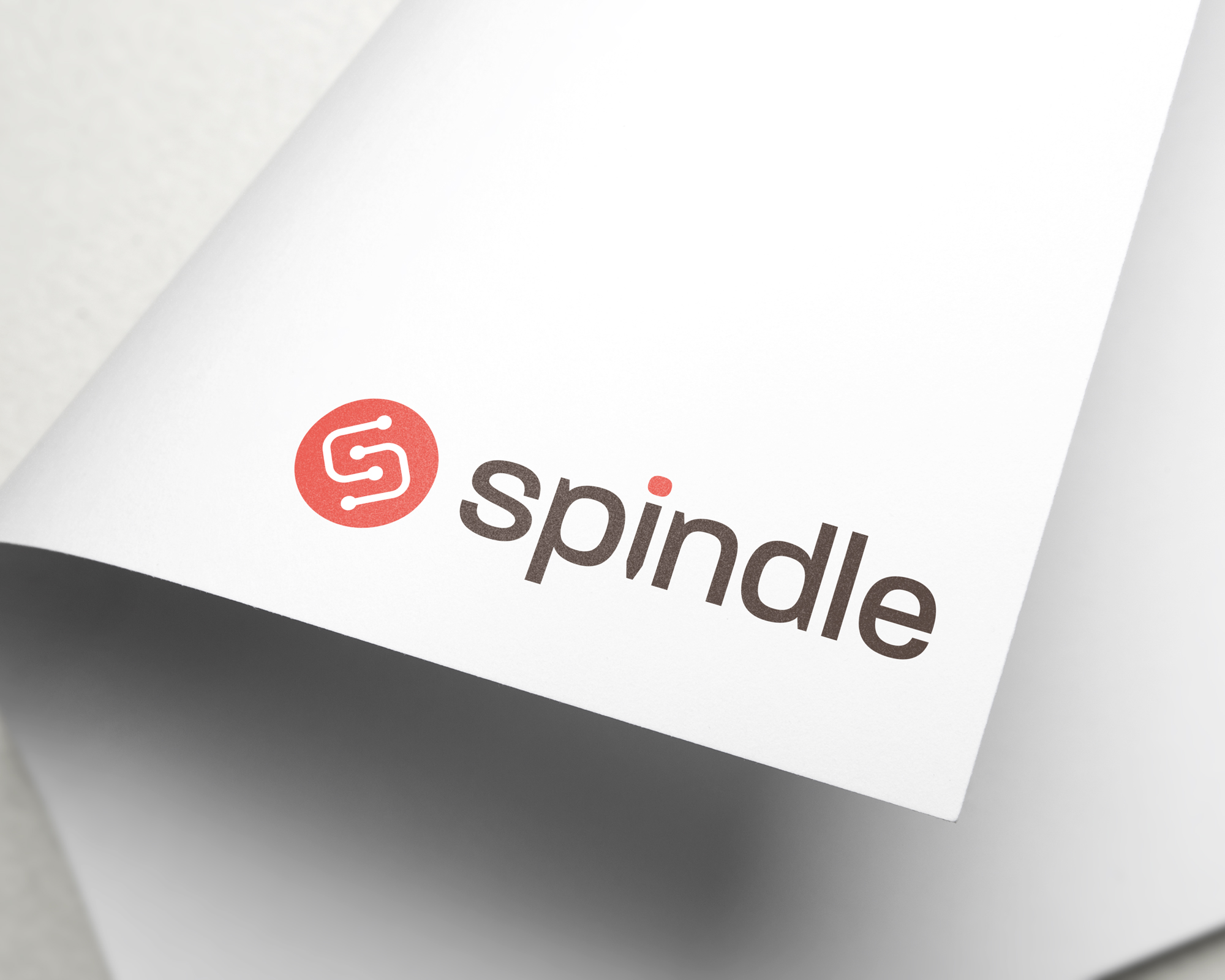
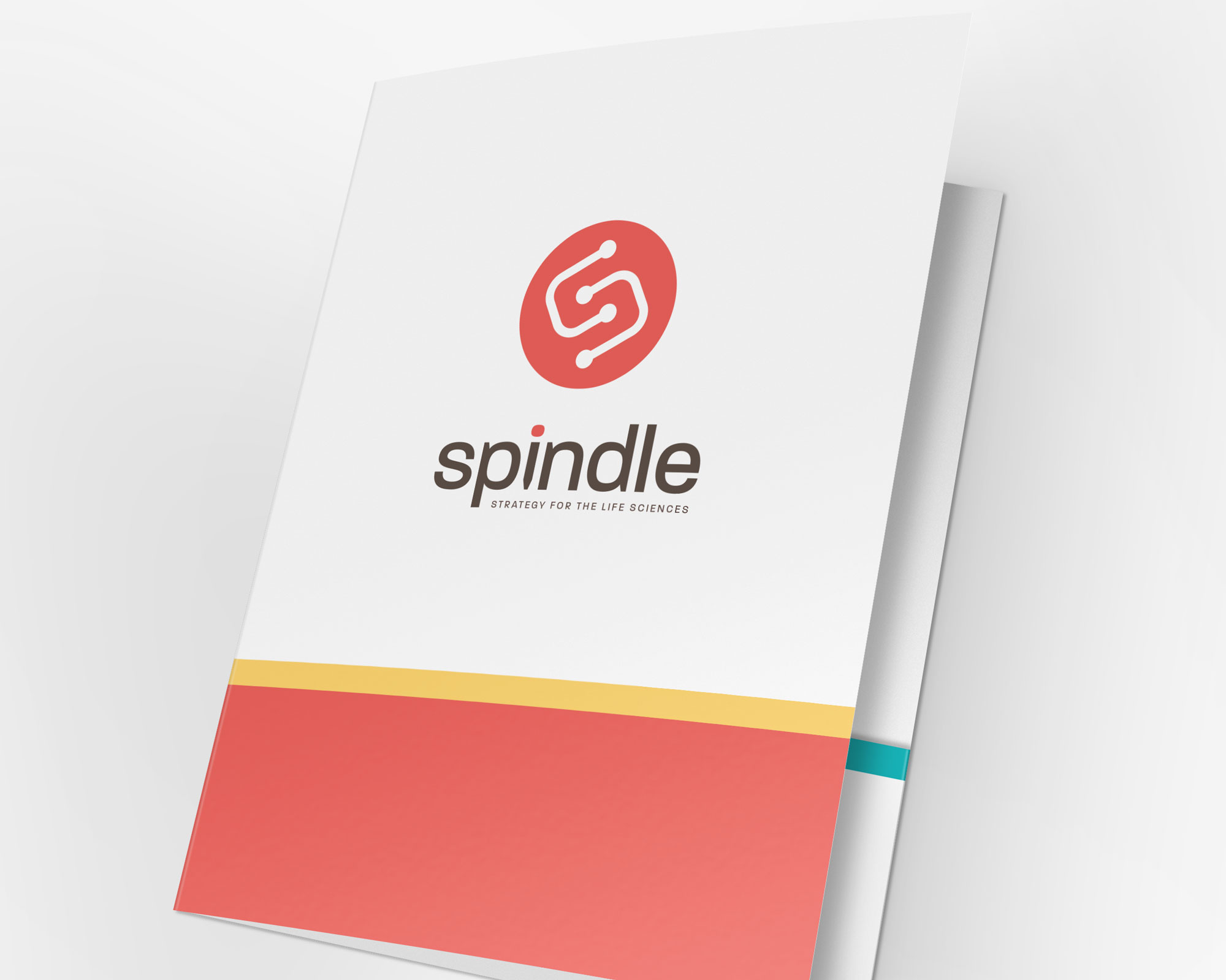
Spindle approached us as a startup big plans and ambitions. Through research and strategic thinking, we provided a number of logo options for Spindle. Their business revolves around connecting researchers with businesses / grants that make their work commercially viable. The logo is meant to instil the idea of connecting two points (loosely resembling a mitotic spindle and featuring an “S” in the negative space) while keeping a clean, identifiable and striking look. We also provided a full identity package consisting of font pairings, colors, and guidelines.
Marketing.
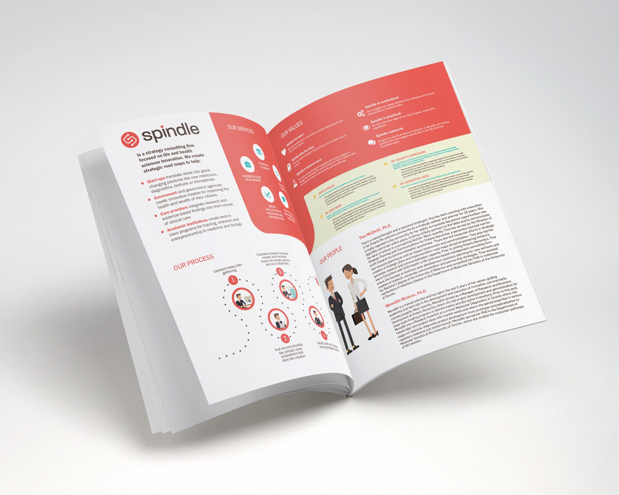
We provided Spindle with a wide assortment of marketing materials including their initial business plan, business cards, stationary, business plans for their clients, illustrations for use on proposals, powerpoint presentations, and the project analysis’ they provide to their clients.
Digital.
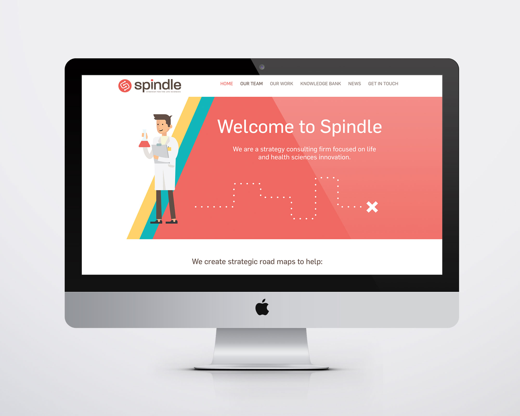
Spindle needed a site that strays away from their fields usual sterile and medical feel. They wanted something warm and inviting while being a platform for them to share articles and studies. We used a wide variety of animation techniques to bring the site to life as well as providing them with newsletter templates and social media assets.

